Brand identity evolution
Ellevation needed an identity that could express both the power of its technology and its commitment to English learners. Spin helped bring those two sides together.
The identity in motion
 ▶ Watch film
The idea & the work
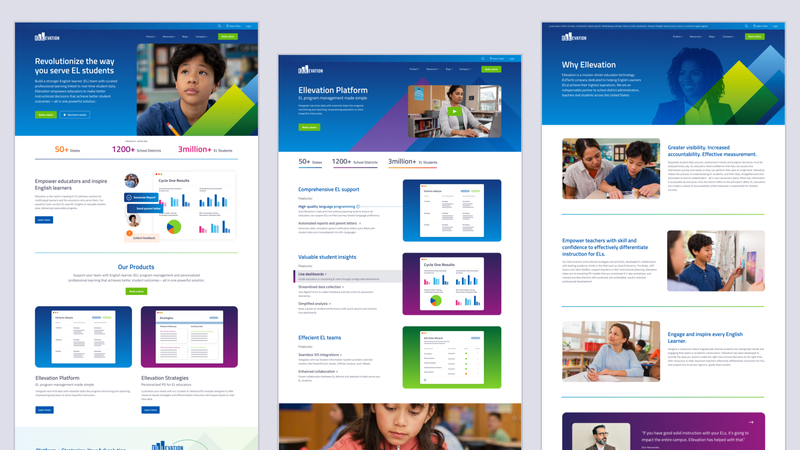
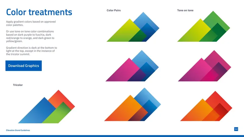
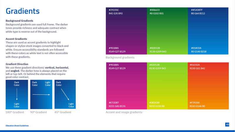
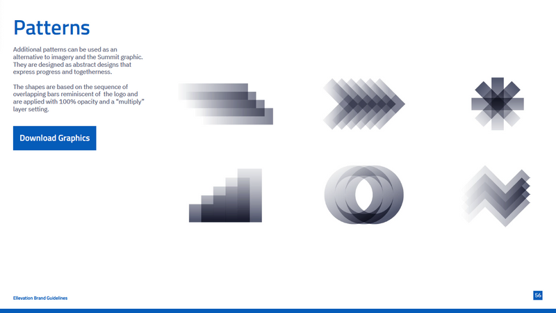
We evolved the visual language and refined messaging into a more expressive, consistent identity. Color, graphic treatments, patterns, and imagery work together as a recognizable system, with room for individual products and communications to have their own expression.
A 12-week program moved from discovery and exploration into brand expression, guidelines, and practical toolkits. The guidelines give Ellevation’s teams a shared foundation for creating work with clarity and consistency. A launch sizzle introduced the evolved identity at the company’s all-hands meeting.
Distinctive by design.
Consistent in use.
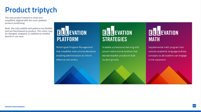
The guidelines bring the visual language together: a connected product family, color, graphic treatments, patterns, and imagery. Clear principles give the team room to create while keeping the brand recognizable.

Bringing the brand
to life.
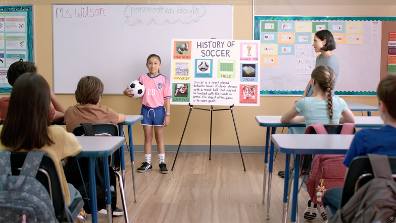
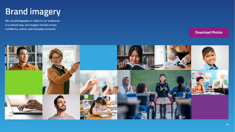
As our partnership continued into the website redesign, we extended the identity through custom photography. Spin art-directed and produced the shoot, creating a cohesive image library for Ellevation’s website and ongoing marketing.