
A refreshed brand.
Brought to life.
A kinetic introduction to Skillsoft’s new visual world, connecting the identity to the people, skills, and possibilities it represents.
Watch the film
 Watch film
The idea & the work
Skillsoft needed to introduce its refreshed identity with energy and purpose across events, websites, and social channels. The creative challenge was to turn a supplied visual system into an experience: something audiences could recognize, feel, and connect with the brand’s promise around skills and growth.
Spin developed the concept, narrative, art direction, and motion approach. Geometry, expressive typography, connected paths, and human imagery give the film a coherent visual language, while music shapes its momentum. Widescreen, square, and vertical versions carry that same direction across the launch.
Make the identity
mean something.
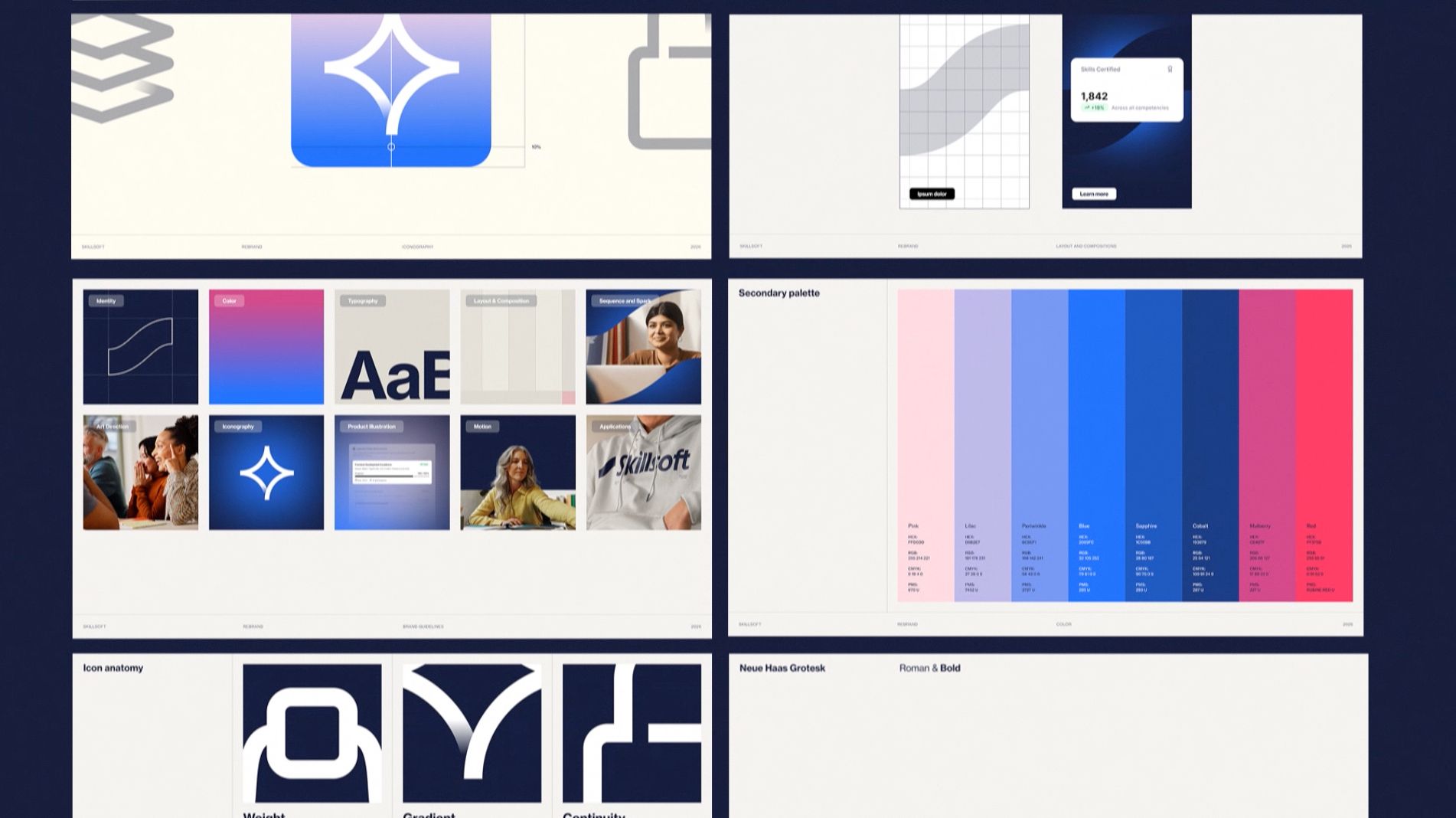
The refreshed identity gave us the foundation: geometry, typography, color, and composition. Our task was to decide how those elements could tell a story together. Revealing the system’s construction gives the audience a way into the new brand, then connects its visual character to a broader idea of growth. The film introduces the change to customers, partners, and employees through movement and feeling.
From construction
to momentum.
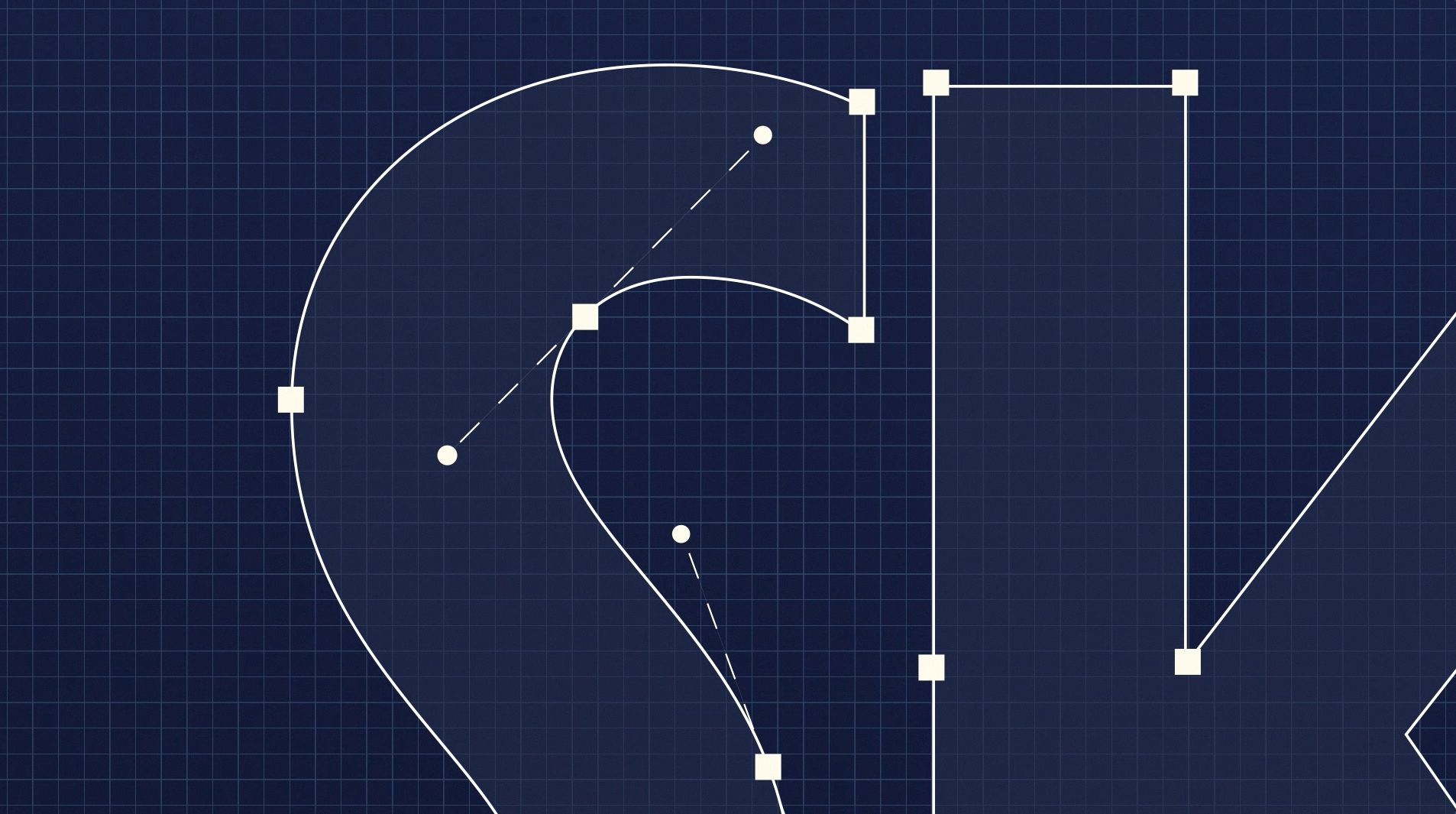
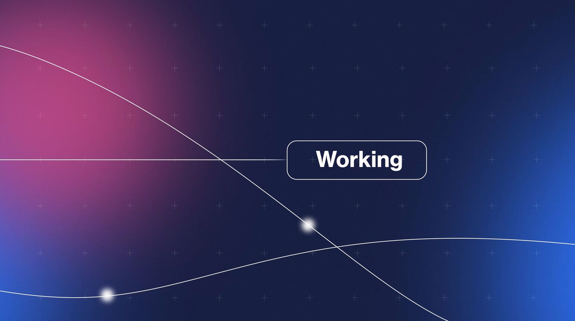
Growth in Motion organizes the creative approach into three connected movements. Blueprint reveals the architecture behind the identity. Pulse brings it to life through expressive type, color shifts, and transitions shaped by the beat. Real World connects that energy to people and their experiences. Repeating lines, forms, and patterns gives these different moments a shared visual logic.


A brand you can feel.
We mapped the rhythm before animation, using music to guide the timing of cuts, transitions, and changes in visual intensity. Abstract sequences establish the brand’s energy; human imagery and focused typography connect it to the people it serves. The story resolves in a clear promise: “See Every Skill. Close Every Gap. Prove Every Outcome.” Design, message, and sound arrive together.

One identity.
Multiple formats.
The film was delivered in widescreen, square, and vertical formats for events, websites, and social channels. Each format needed its own compositional decisions: how large the typography should feel, where the visual focus sits, and how motion travels through the frame. We adjusted layouts and reanimated sequences where needed to preserve the message and rhythm across screens.