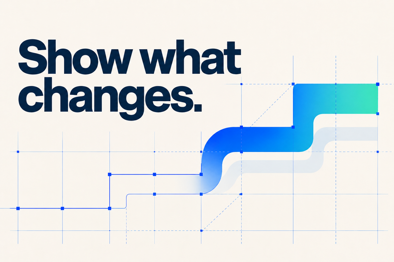
A product demo should make one thing unmistakable: what gets better for the person using it. The strongest demo video best practices start there, with a specific audience, a useful outcome, and enough product evidence to make the promise believable.
Most enterprise products can do more than one film can explain. That is a briefing problem before it is an editing problem. When every stakeholder adds a feature, the video gets longer while the idea gets harder to see.
At Spin, we start with the change the audience needs to understand. Then we build the story, choose what to show, and give each moment a job.
1. Write the change into the brief
“Explain the platform” is a topic. “Help a marketing leader see how their team can find an approved asset without chasing five people” is a direction.
Before scripting, finish this sentence: After watching, [specific viewer] should understand [one change] and feel ready to [next action]. Treat it as the decision rule for the film. A feature earns its place when it helps prove that change.
Agree on five things: the viewer, their current friction, the central promise, the evidence you can show, and the next step. If the promise is still contested, resolve it before storyboarding. A shared message house can help the team separate the main idea from its supporting points.
2. Give the video one primary job
A launch film, a product walkthrough, and an onboarding tutorial can feature the same product while answering different questions.
- Earn interest: Why should I care? Show the problem, the possibility, and a reason to keep exploring
- Support evaluation: How would this work for my team? Show a representative workflow and enough detail to assess it
- Help someone succeed: What do I do next? Show the steps clearly and make the answer easy to find again
A short introduction should not pretend to provide the depth of a technical evaluation. Equally, a detailed tutorial does not need to behave like an advertisement. When the audiences or jobs differ, plan a small family of videos with a clear role for each.
3. Build a story around a task
A menu tour follows the software’s organization. A useful demo follows the viewer’s need. Choose a situation they recognize, then show the product changing it.
For example, imagine a hypothetical asset-management platform. Instead of opening with tabs for search, approvals, and permissions, begin with a team trying to find the right approved file before a launch. Show the search, the approval status, and the correct version being shared. The capabilities become evidence inside a story.
A practical sequence is:
- Situation: Establish the task and why it matters
- Friction: Show what makes it difficult today
- Action: Demonstrate the few product moments that resolve it
- Change: Make the useful result visible
- Next step: Give the viewer a relevant way forward
This is a planning structure, not a rule that every film must follow literally. Sometimes the outcome is the strongest opening. Sometimes a surprising visual makes the problem immediately clear. The story still needs a connection between the promise and the proof.
4. Let the product prove it. Let design make it clear.
Use recognizable interface moments when someone needs to understand how a task works. Remove irrelevant notifications, prepare realistic sample data, and hold important states long enough to read. Never expose real customer information or imply a capability the product does not have.
Motion design can make an abstract relationship visible: connected information, a handoff between teams, or an action triggering a useful result. It works best when it helps the audience understand something that a literal screen recording would struggle to communicate.
The right approach may combine screen capture, typography, illustration, and animation. Choose the mix around the explanation. Our guide to explainer video styles looks at those tradeoffs, and our animation and motion work shows how different visual approaches serve different ideas.
5. Choose length around the viewing context
There is no universal two-minute rule. A new prospect deciding whether to care has a different tolerance for detail than an evaluator trying to answer a specific question.
Wistia’s video-length guidance groups short awareness pieces below a minute, educational videos around one to five minutes, and deeper nurture content around five to thirty minutes. Those are useful starting points, not performance guarantees or targets to fill.
Ask where the film will appear, what the viewer already knows, and how much explanation the next decision requires. Put the essential idea early. If a scene repeats something the audience already understands, shorten it or remove it.
6. Make the explanation work in the real world
Review the film at the size and in the context where people will actually see it. A dashboard that looks clear on an editing monitor can become unreadable in a mobile feed. A sound-off viewing environment needs visual comprehension planned into the creative approach.
Include accurate captions for speech and meaningful audio, a useful transcript, and descriptions of essential visual information where needed. Check text contrast, readable type, and player controls. W3C’s accessible media guidance is a useful planning reference; our color accessibility checks cover the visual system.
Plan localization and alternate aspect ratios before production. Give translated language room to breathe and adapt the composition rather than assuming every frame can survive a crop.
7. Measure the job you gave the video
Views tell you that a player recorded plays. They do not, on their own, tell you whether someone understood the product or moved closer to a useful decision.
- For an introduction: Examine early retention and clicks to the next relevant product page
- For evaluation: Track relevant CTA clicks, qualified demo requests, and the questions sales teams hear afterward
- For onboarding: Look at task completion and recurring support questions alongside viewing behavior
Use consistent event definitions and compare like-for-like audiences and placements. A completion rate from a short social teaser is not a fair benchmark for a detailed walkthrough. Attribution also has limits: a video can contribute to a decision without being its sole cause.
Use the results to choose the next edit. An early drop may suggest a weak opening or the wrong audience. Repeated questions about the same step may reveal a gap in the explanation. These are hypotheses to investigate, not automatic diagnoses.
Before approving the film
Watch it with someone who did not help make it. Ask what the product changes, what evidence convinced them, and what they would do next. Their answer is more useful than asking whether they liked it.
Then check product accuracy, accessibility, links, the CTA destination, and each delivery format. For a launch, connect those checks to the wider product launch plan so the film and the destination tell the same story.
Common questions about product demo videos
What should a B2B demo video include?
A recognizable customer task, a clear outcome, product evidence, and a relevant next step. The depth should match the viewer’s role and stage of evaluation.
Should a demo use animation or screen recordings?
Use screen recordings to demonstrate actual behavior. Use animation to clarify relationships, focus attention, or explain what is difficult to see. A hybrid approach can do both, provided the visual treatment stays faithful to the product.
How long should a product demo be?
Long enough to answer the viewer’s question, with no scenes that merely repeat it. Start with the placement and decision the video supports, then test whether the explanation is complete.
Make the product easier to choose
Spin brings creative strategy, narrative, design, and production into the same conversation. We help teams decide what matters, develop a visual approach that serves the idea, and carry that direction through the finished work.
The aim is not to squeeze the entire product into one video. It is to make one useful change feel clear, credible, and worth exploring.