A stronger fabric.
A clearer brand.
A connected identity system for a credit union built around people, possibility, and community.

The idea & the work
Harborstone’s promise is personal: membership can help people achieve their financial goals. We developed a brand system that turns that promise into a consistent way to communicate, from the story and tone of voice to the smallest visual detail.
The 46-page guidelines bring the brand’s purpose, audiences, visual language, and everyday applications into one practical resource. The work gives teams a shared foundation while allowing room for different messages, formats, and experiences.
Membership makes
it possible.
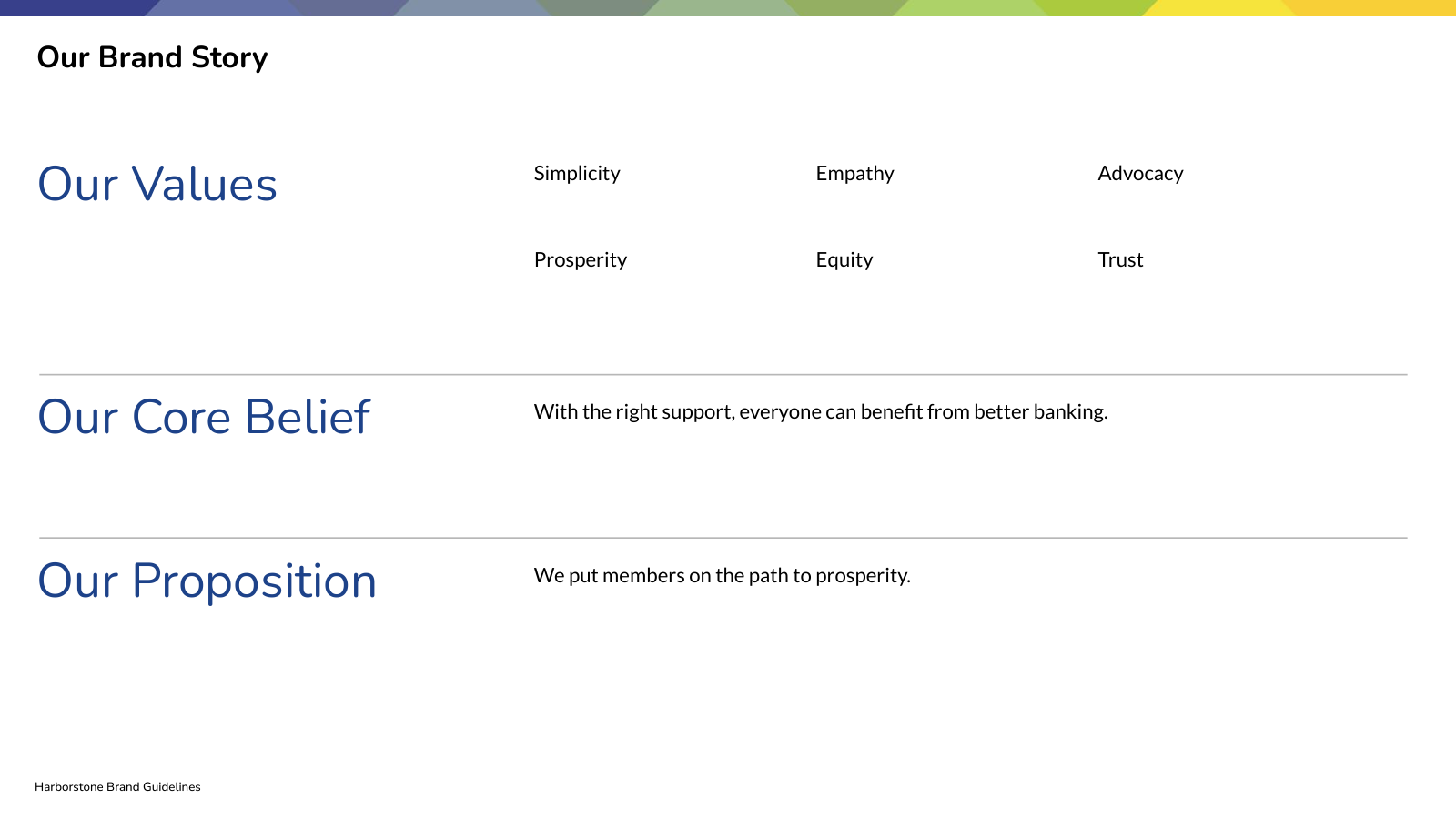
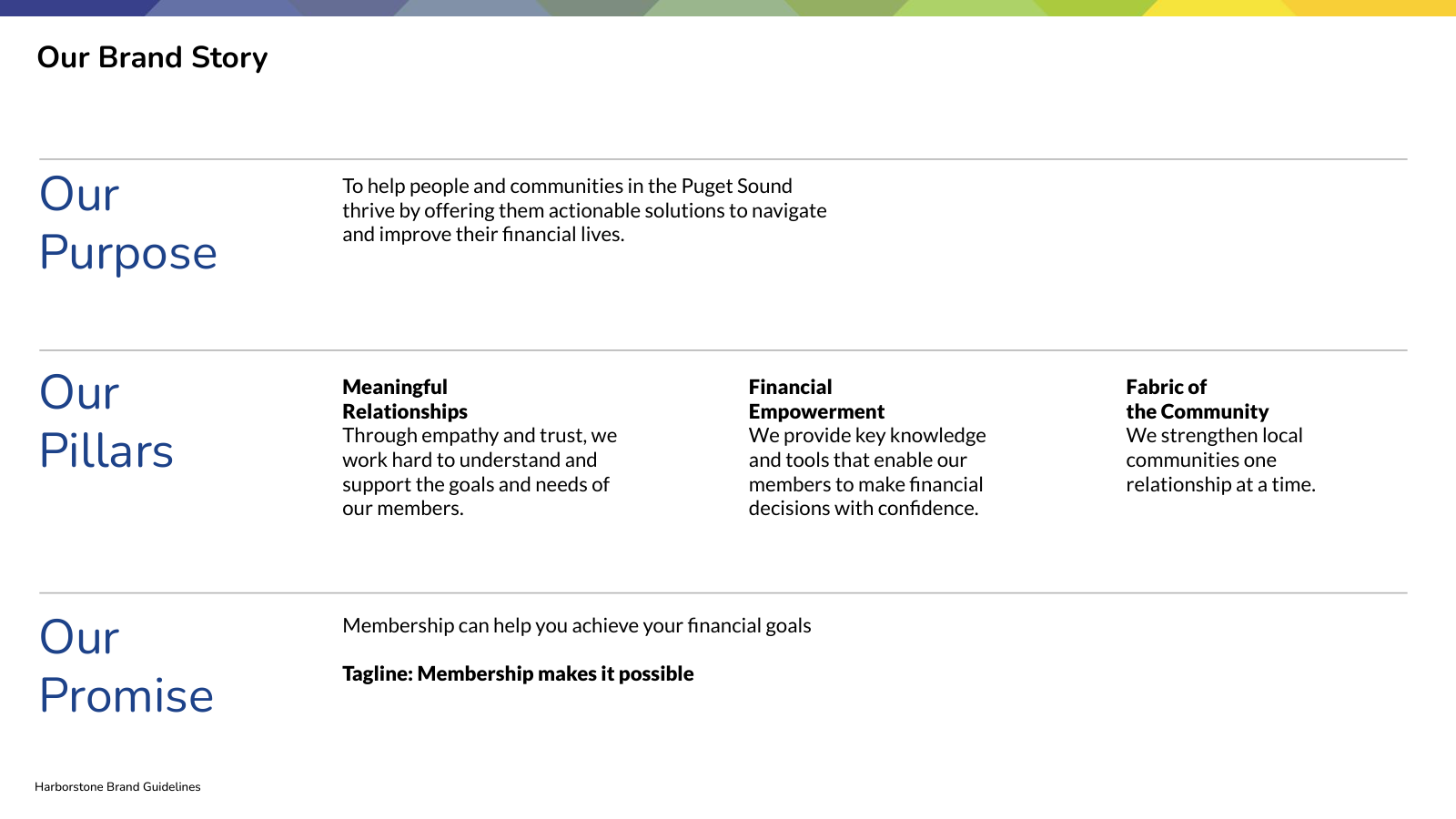
The system starts with the people Harborstone serves. Meaningful relationships, financial empowerment, and the fabric of the community give the brand a clear foundation. The guidelines connect that purpose to a promise, shared values, and a recognizable tone of voice.
A familiar mark.
A consistent signature.
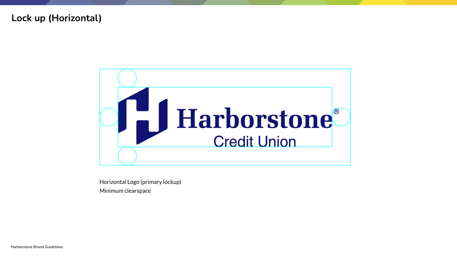
The guidelines establish how the Harborstone identity shows up: the master logo, horizontal and stacked lockups, clear space, placement, and contrast. A shared set of rules protects recognition across every application.
Warmth with structure.
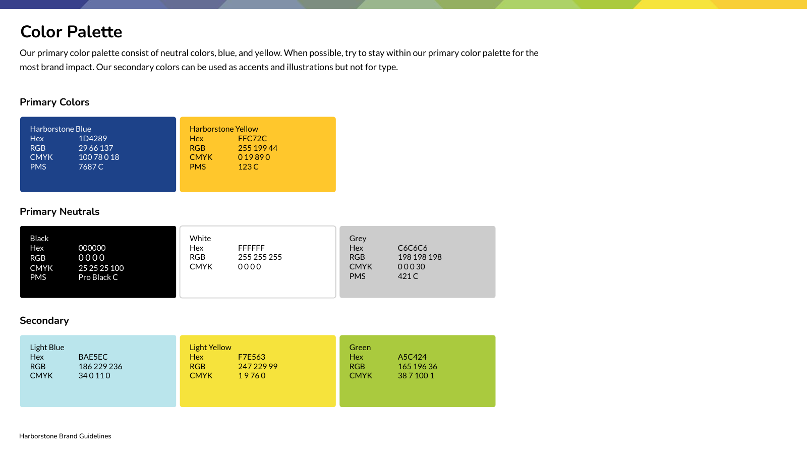
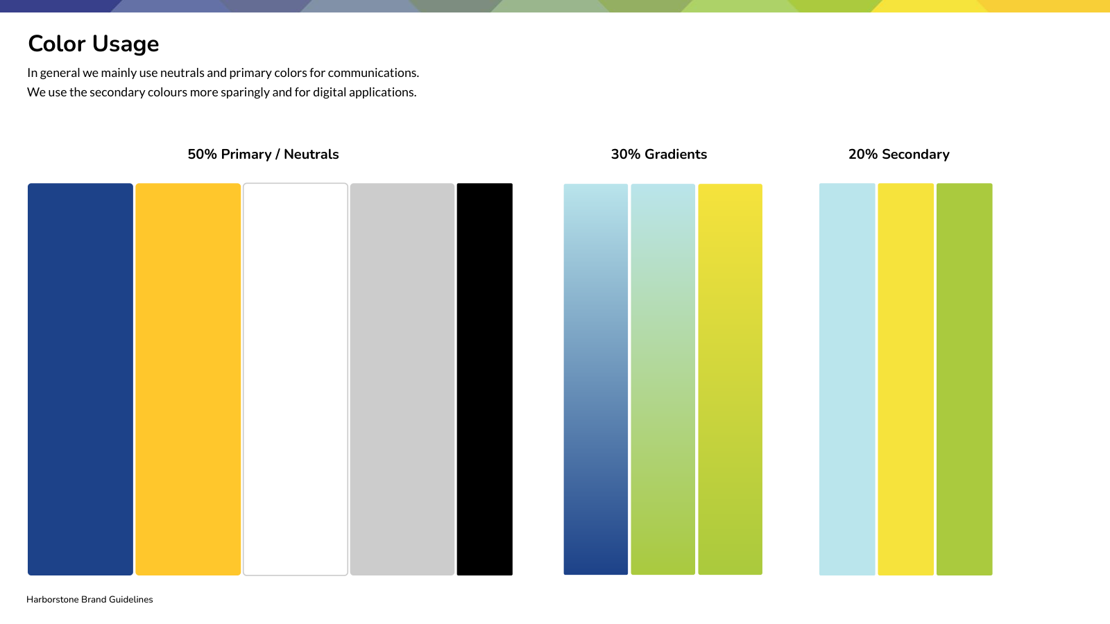
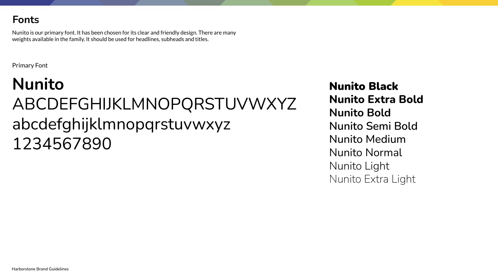
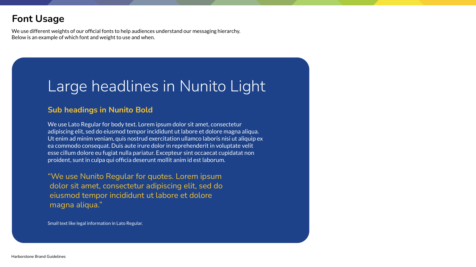
Harborstone blue anchors the palette, with yellow, green, and lighter tones adding warmth and range. Friendly typography and a defined messaging hierarchy make communications approachable and easy to read.
The thread that
connects the brand.
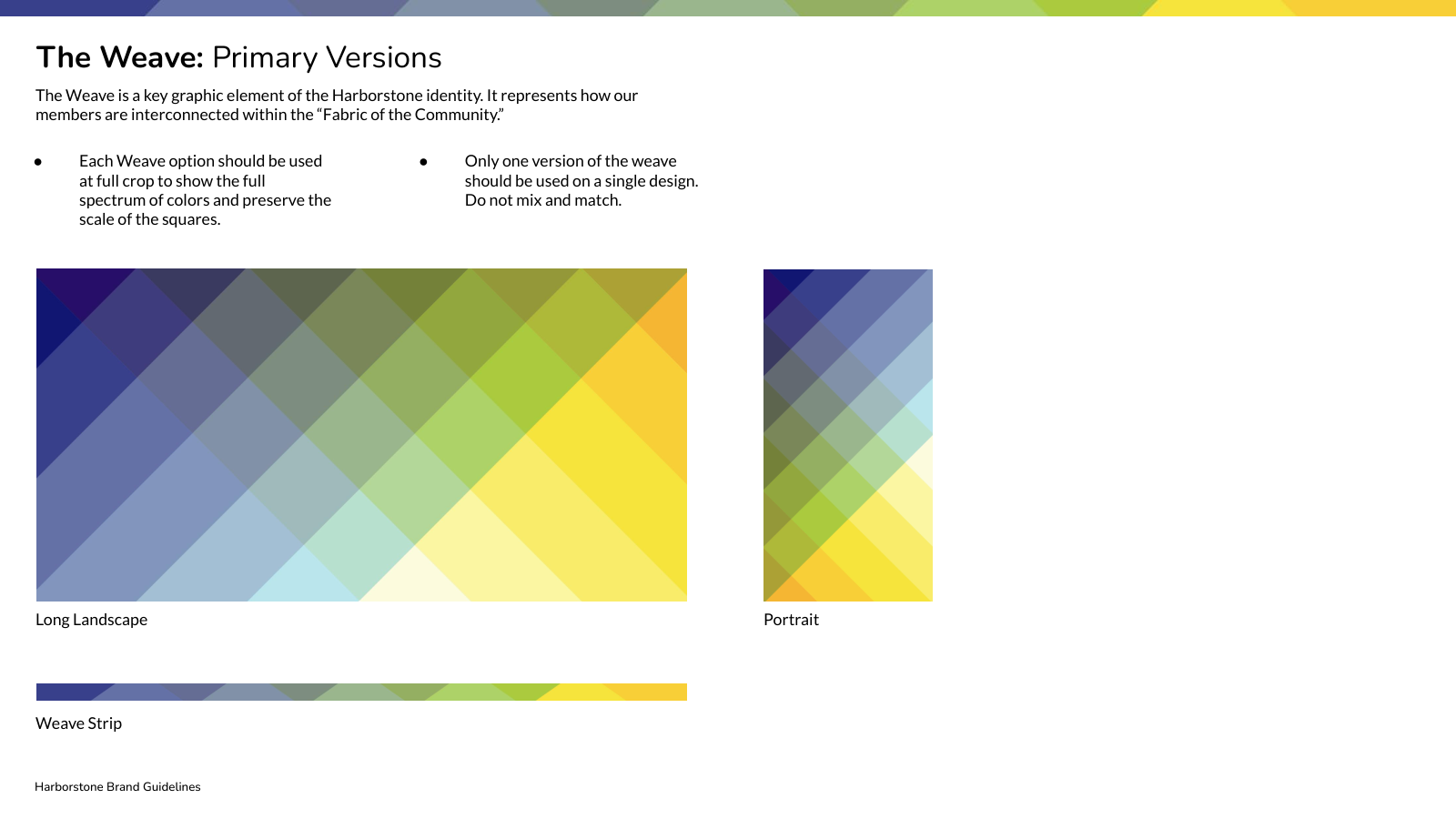
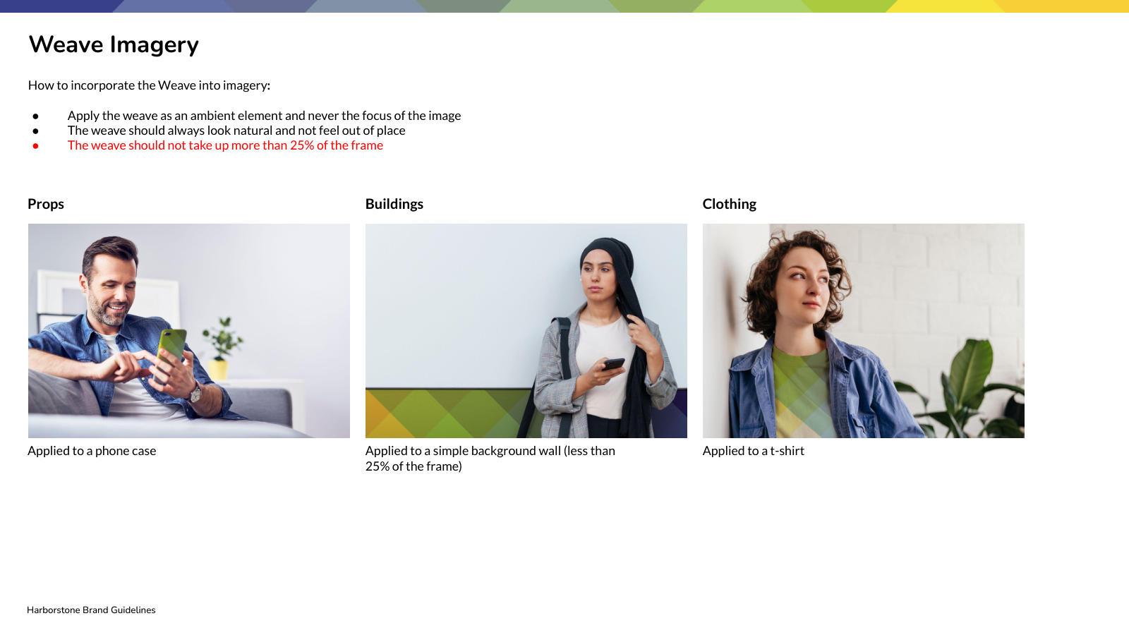
The weave expresses the connections between people and their community. Guidance for its formats, cropping, placement, and use within imagery gives this distinctive brand element a consistent role across communications.
People at the center.
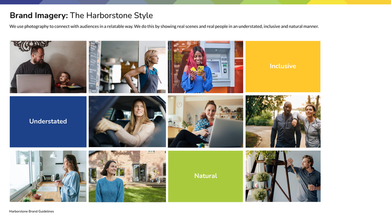
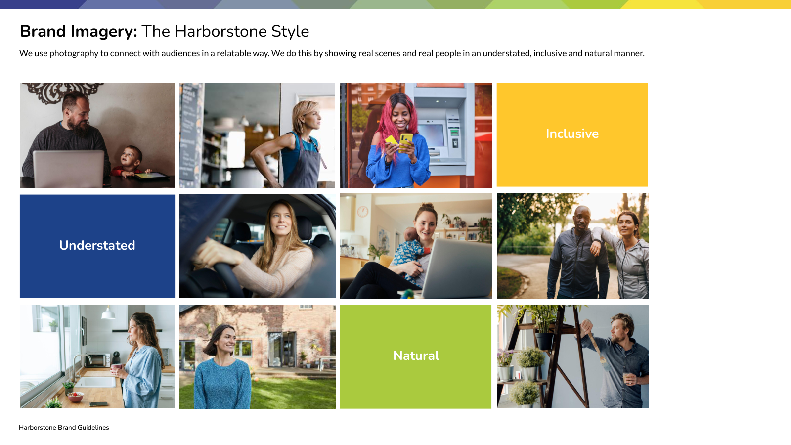
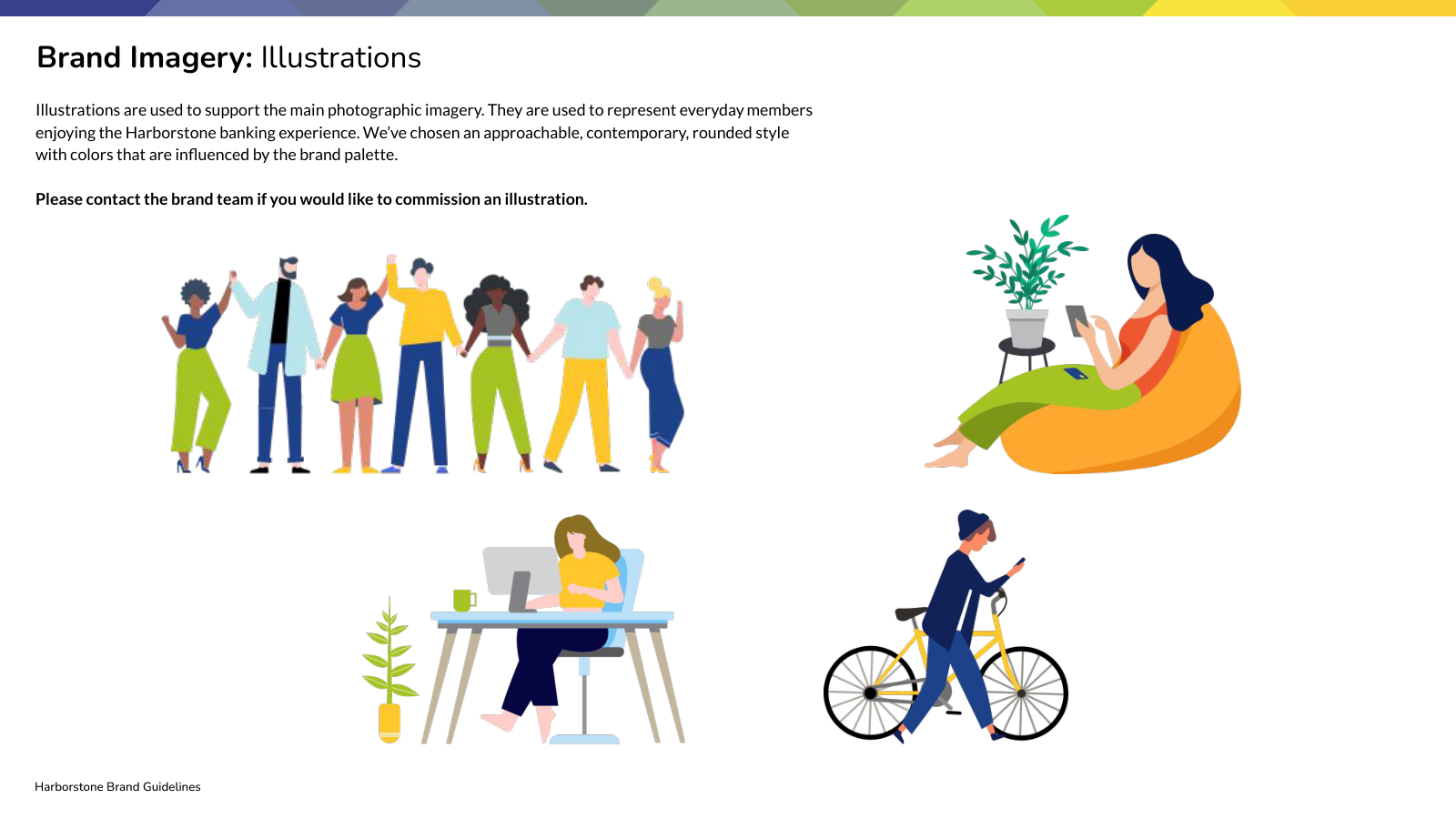
Photography guidance focuses on relatable moments, natural interactions, and a human point of view. Illustration adds another expressive tool for explaining ideas and supporting the brand story.
Many expressions.
One recognizable family.
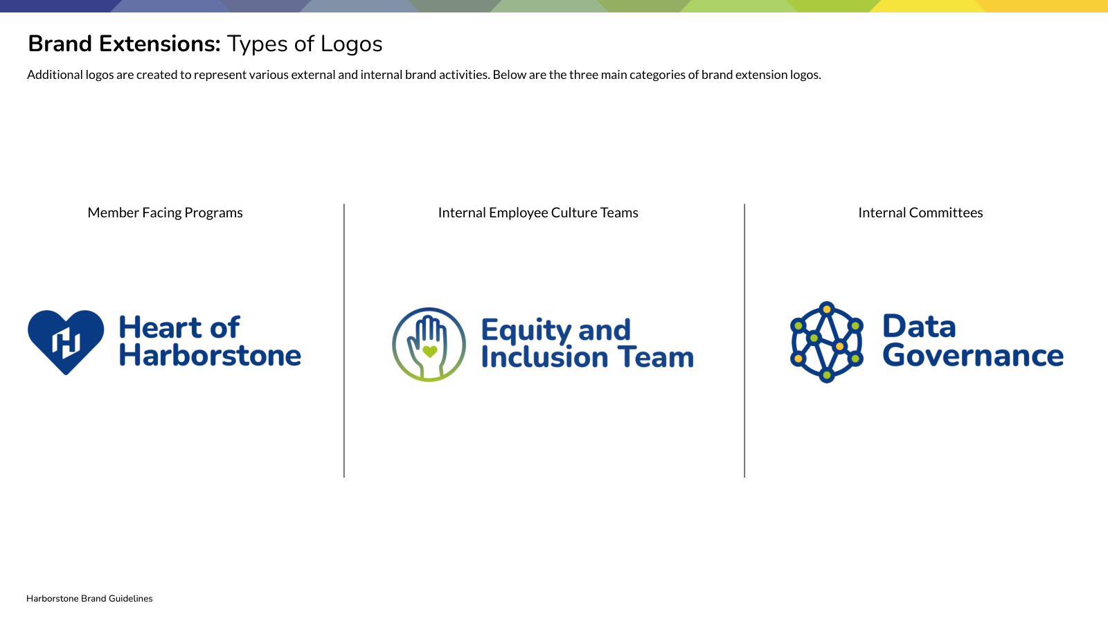
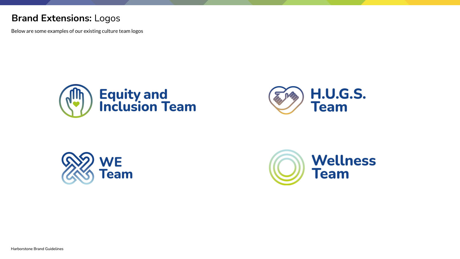
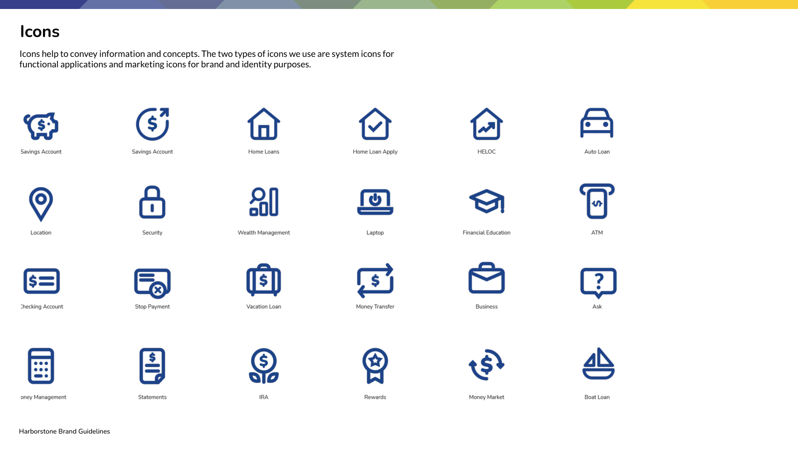
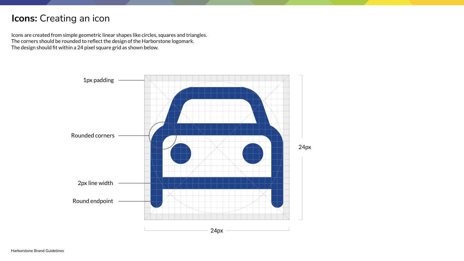
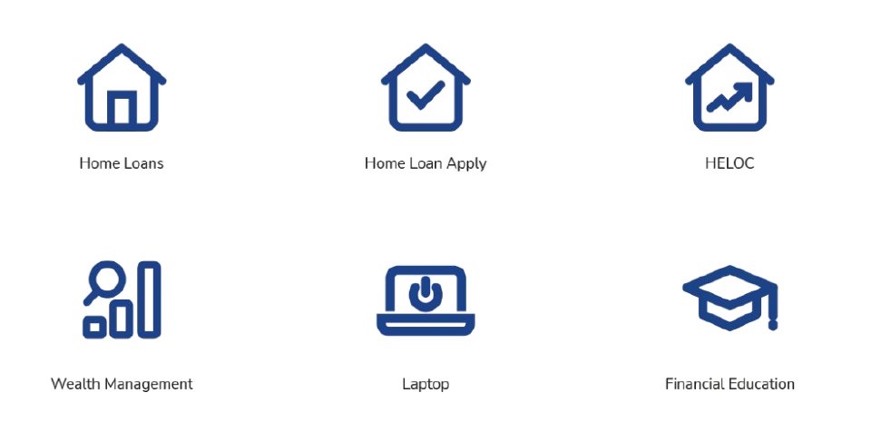
The system makes room for member programs and internal teams without losing the connection to Harborstone. Rules for brand extensions and a consistent geometric icon style give teams practical tools to build on.