
A more human way
to bank online.
A website design that brings everyday banking, personal support, and community into one connected experience.
The idea & the work
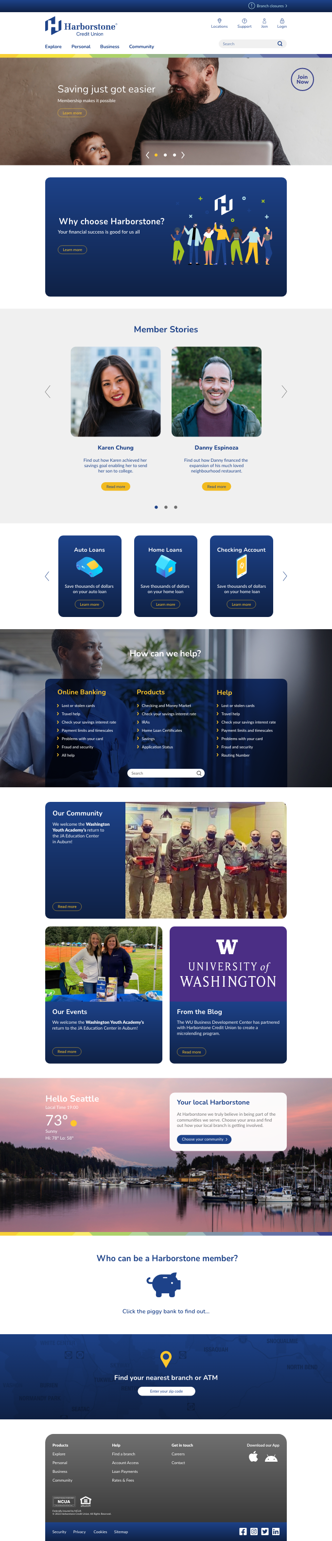
A credit union website serves people at very different moments. Some are meeting the brand for the first time. Others need to get straight to their accounts, find a product, or get help. We designed Harborstone’s new website around those different needs.
The work connected wireframes, desktop and mobile layouts, navigation, product storytelling, and the Harborstone visual system. Separate homepage experiences for new and returning visitors changed the emphasis without changing the brand.
Spin developed the website design and supplied layouts, assets, and interaction guidance to NCR for development.
Different starting points.
One clear experience.
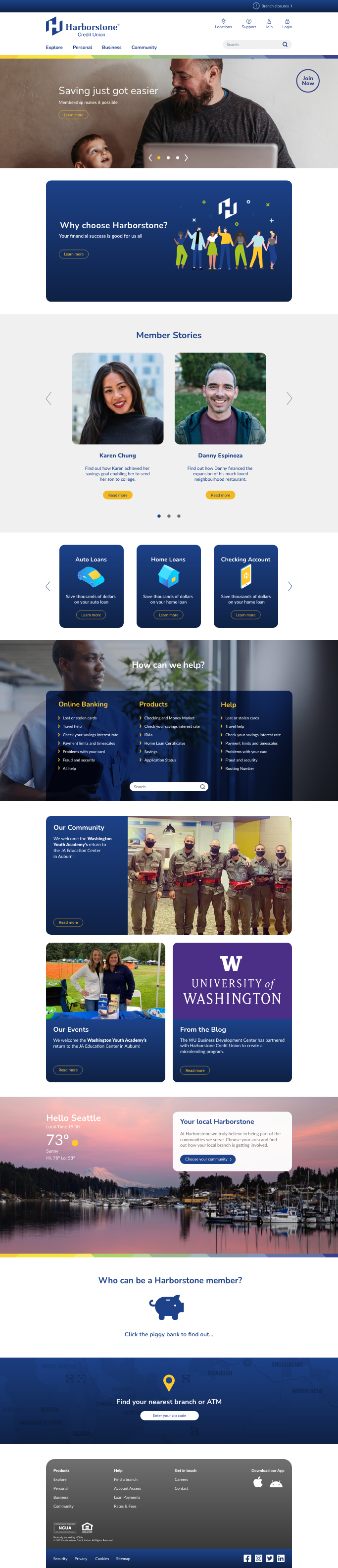
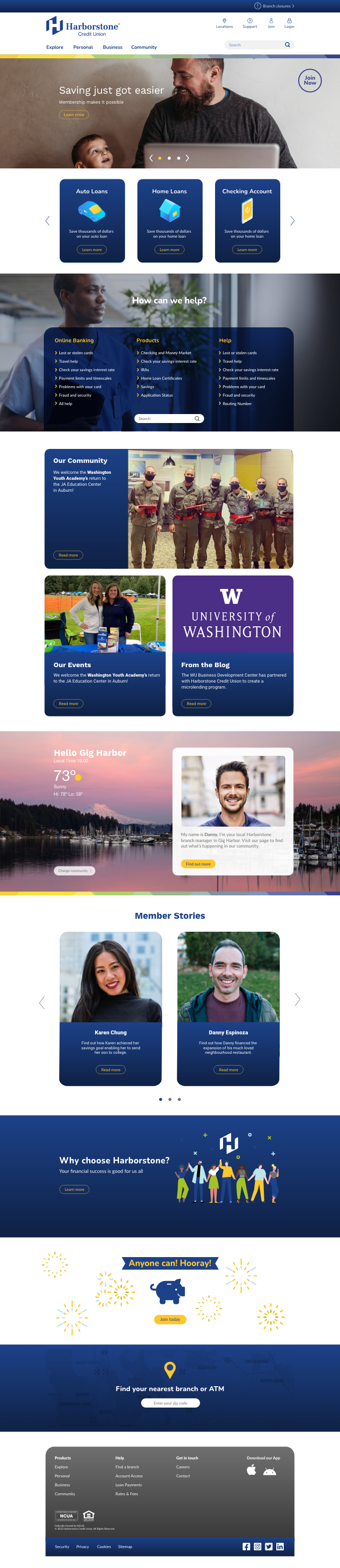
The new-visitor design introduces Harborstone through its purpose, member stories, and community. The returning-visitor design brings products and practical help forward. Both use the same visual system to connect day-to-day tasks with the bigger value of membership.
Make the next step
feel straightforward.
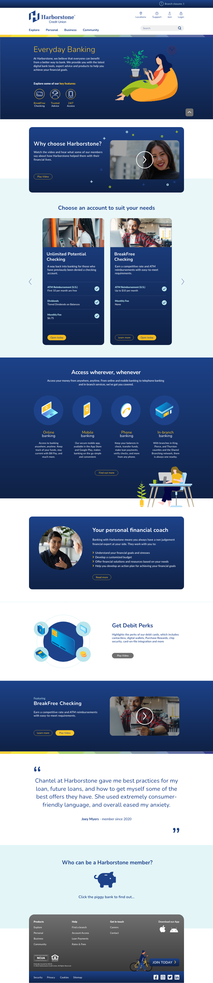
The Everyday Banking page connects account choices, digital services, financial coaching, and member benefits. On mobile, the homepage reorganizes the same story into a focused vertical sequence, with clear navigation and access to essential tasks.

The details make it work.
Clear paths
Navigation and help content organize the experience around the questions people bring to a banking website.
A connected system
Color, typography, illustrations, imagery, and recurring content modules carry Harborstone’s identity across pages.
A practical handoff
Desktop and mobile layouts, design assets, and notes on hover states and animation support implementation by NCR.