Viva product launch
A new chapter for Microsoft Viva needed a launch film with the same energy. Spin introduced the platform’s next generation through design, motion and sound.
Watch the film
 ▶ Watch film
The idea & the work
The refreshed identity had not yet been developed for motion. We established how its visual elements would behave, connecting new product features to an expressive animation system.
The film premiered at Microsoft’s live-streamed launch event, bringing creative strategy, copy, design, 2D animation and custom music into one coordinated introduction.
A platform story.
A human reason.
The brief was to spark excitement about Viva’s innovations while connecting the product story to employee engagement, productivity, and growth. With multiple apps and services to introduce, the film needed a clear organizing idea, not simply a sequence of feature announcements.
Our creative exploration centered on people growing together. We considered how people, circular forms, and inventive typography could express connection, knowledge, and progress. Those themes gave the product information a broader purpose and helped the launch feel like one cohesive story.
Give the new identity
a sense of movement.
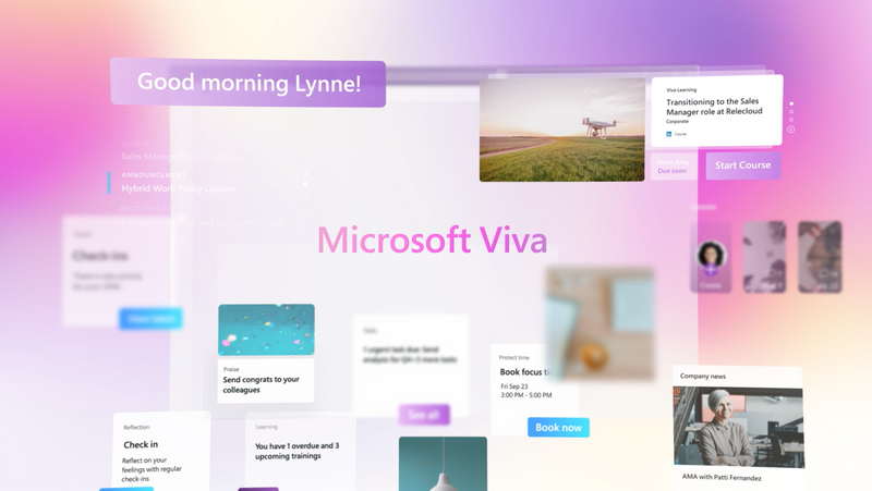
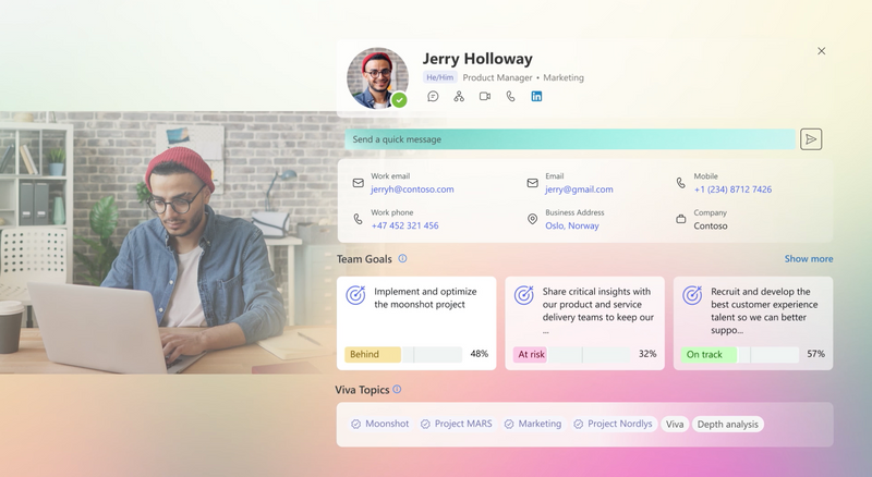
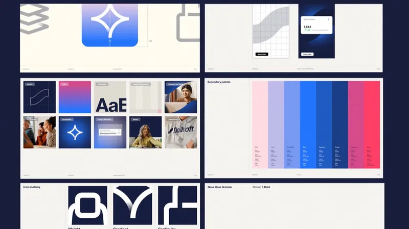
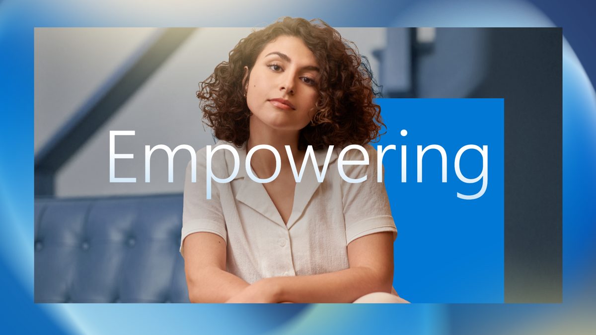
The refreshed Viva identity provided the starting point. Early style frames tested how people, interface details, typography, and soft color fields could coexist in a fluid visual world.
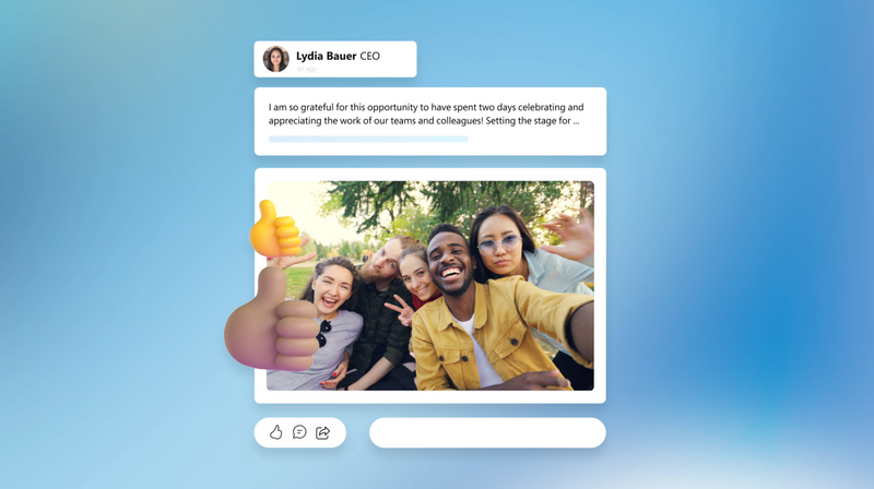
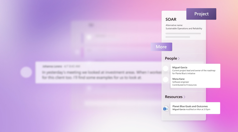
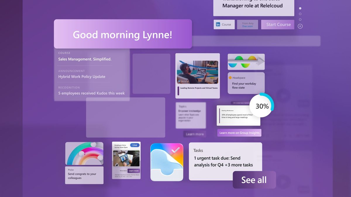
We explored scale, layering, and contrast to make dense product content approachable. Human imagery established relevance; type guided the message; UI details supplied the concrete proof. These working style frames show the visual language before the final animation.

Build the sequence.
Then make it move.
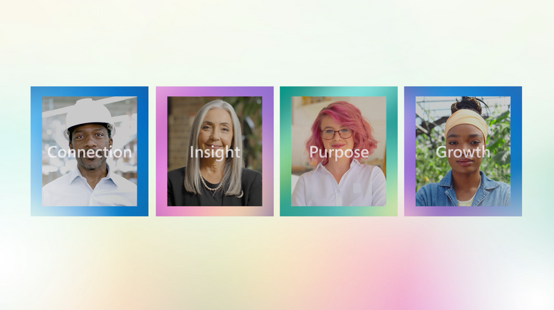
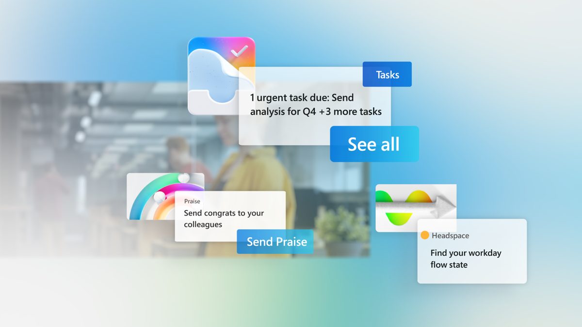
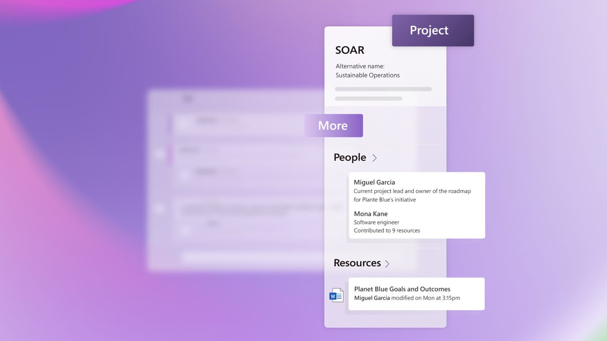
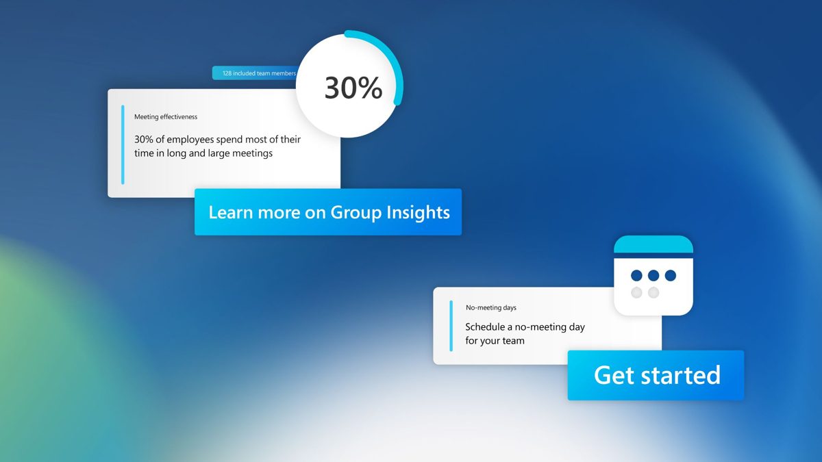
The storyboard organized the launch around connection, growth, insight, and purpose, leading toward an integrated employee experience. That structure gave each product moment a role in the larger story.
We developed the boards into a timed animatic before full animation. Review focused on the clarity of the people sequence, the relationship between type and the following UI shot, and whether viewers had enough time to understand the information. These selected boardamatic stills show that working sequence.


One coordinated
introduction.
The animation connects messages through changes in scale, layered interfaces, flowing brand forms, and typographic transitions. Instead of treating each product as a separate chapter, the visual system keeps the viewer moving through one connected platform.
Custom music was developed against the evolving edit. The boardamatic established the timing before the composition and animation were refined together. With no voiceover, typography, image, music, and sound design each had a clear job: guide attention, create momentum, and make the launch memorable.
The finished visual language