How We Built the Skillsoft Brand Refresh Sizzle: Motion as Brand Language
A new logo, color palette, positioning platform, and visual system only become real when audiences experience them. That's where a brand launch film can play a critical role.

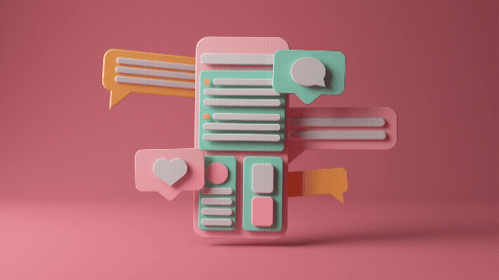
When Skillsoft completed a major brand refresh, they partnered with Spin Creative to develop a 45-second motion-driven launch film designed to introduce the new identity to customers, partners, and employees. Rather than treating the refreshed brand as a graphic package layered onto a video, we built the entire film from the brand system itself.
Here's how we approached the project and the creative principles that shaped the final result.
Skillsoft Brand Refresh Sizzle
What Is a Brand Refesh Sizzle?
A brand refresh sizzle is a short-form piece of content designed to introduce a new brand identity, positioning, or strategic direction to the market.
Unlike a product demo or corporate overview video, a brand launch film is focused on perception. Its purpose is to create momentum, establish emotional resonance, and signal that something meaningful has changed.
For enterprise brands, launch films often become cornerstone assets used across websites, events, social channels, internal communications, and marketing campaigns.
Our Creative Strategy: Motion as Brand Language
The central creative conviction behind the Skillsoft launch film was simple:
The brand shouldn't sit on top of the film. The film should be built from the brand.
Too often, launch videos use a new identity decoratively. The logo appears at the end. Colors appear in transitions.
Typography supports messaging.
We wanted Skillsoft's identity system to become the visual language of the piece itself.
Every motion cue, typography treatment, color transition, and compositional decision originated from the refreshed brand system. The visual identity wasn't supporting the story. It was the story.
Why We Chose Reduction Over Coverage
One of the biggest challenges in any rebrand launch is resisting the urge to explain everything.
A new identity often represents months or years of strategic work. Stakeholders naturally want to showcase every element. But a launch film succeeds through focus, not volume.
Our approach was to reduce rather than expand.
Instead of attempting to communicate every aspect of the brand refresh, we focused on a small number of carefully selected moments designed to create impact and curiosity.
A launch film isn't a brand guideline document. It's an invitation to explore further.
The "Growth in Motion" Framework
To guide the creative, we developed a framework called Growth in Motion.
The concept centered on revealing transformation rather than simply presenting a finished identity.
Blueprint
The film opens by exposing the underlying architecture of the brand system. Grids, construction lines, and geometric forms suggest intentionality and craftsmanship before resolving into finished design elements.
Pulse
The center of the film delivers energy and momentum through rapid typography transitions, synchronized color shifts, and beat-driven editing. Here, motion becomes the primary storytelling device.
Real World
The final section places the brand into practical contexts, demonstrating how the identity functions beyond design presentations and becomes part of the customer experience.
Why Beat-Synced Motion Design Matters
The rhythm of the Skillsoft film was planned before animation began.
Every cut, transition, and motion event was mapped to the music track's tempo, creating a tighter relationship between sound and visuals.
When motion design is synchronized to rhythm at this level, viewers don't simply watch the content. They feel it.
The result is a more memorable brand experience and a stronger sense of momentum throughout the film.
Extending the System Beyond Widescreen
The launch film began as a 16:9 experience, but today's audiences encounter brands across far more surfaces than a single screen size.
To create square and vertical versions, we revisited key moments throughout the film, redesigning layouts and reanimating sequences where necessary.
Rather than treating alternate formats as crops of the original, we approached them as extensions of the same motion system, allowing the brand to maintain its energy, clarity, and impact across every channel.
What Makes a Great Brand Refresh Sizzle ?
The best brand refresh sizzles don't attempt to explain everything.
They create momentum.
They establish emotion.
They communicate confidence.
Most importantly, they make audiences want to learn more.
For Skillsoft, that meant creating a film that expressed the energy of the new identity while reinforcing the company's positioning around growth, capability, and outcomes. The result was a launch asset designed to help the market experience the brand, not simply observe it.
Frequently Asked Questions
What is a brand launch film?
A brand launch film is a short-form video designed to introduce a new brand identity, positioning, or strategic direction to audiences.
What is a brand refresh sizzle video?
A brand refresh sizzle video is a fast-paced motion piece that generates excitement and awareness around a company's new visual identity or messaging platform.
Why is motion design important in branding?
Motion helps brands communicate personality, energy, hierarchy, and emotion in ways static design cannot. It transforms visual identity into an experience.
How long should a brand launch video be?
Most effective launch films range from 30 to 90 seconds, depending on the audience and distribution strategy.
About Spin
Spin Creative is a brand storytelling agency specializing in branding, design, motion, and advertising. We help enterprise and growth-stage brands create scalable creative ecosystems that move audiences and build demand.